
How to Improve House-Number Visibility Without Sacrificing Style
Introduction
House numbers have a practical job, but they also influence how a home looks from the street. They help visitors, delivery drivers, service providers, and emergency responders identify the correct property. At the same time, they sit on one of the most visible parts of the exterior, which means they can either support the home’s style or weaken it. A number display that is too small may disappear, while one that feels too bold or mismatched can interrupt the design of the façade.
The best approach is not to choose between visibility and style. A well-planned address display can improve readability while still feeling like part of the architecture. The key is to consider contrast, size, placement, material, and surrounding exterior details together. When these factors are handled carefully, house numbers become more than a requirement. They become a refined design feature that makes the property easier to find and more polished from the curb.
Why House-Number Visibility Matters
A visible address reduces confusion. Guests can confirm they have arrived at the right home, delivery drivers can complete drop-offs faster, and service professionals can avoid circling the block or stopping at the wrong driveway. This becomes especially important in neighborhoods where homes share similar layouts, paint colors, rooflines, or landscaping. If the address is not readable from the street, people are forced to rely on guesswork.
Visibility is affected by more than number size. Lighting, background material, shadows, plant growth, parked cars, porch columns, and viewing angle all influence how quickly an address can be recognized. A display that looks clear up close may not work well from a vehicle. Homeowners should evaluate address visibility from the street, at night, and from both directions of approach to understand whether the display is truly doing its job.
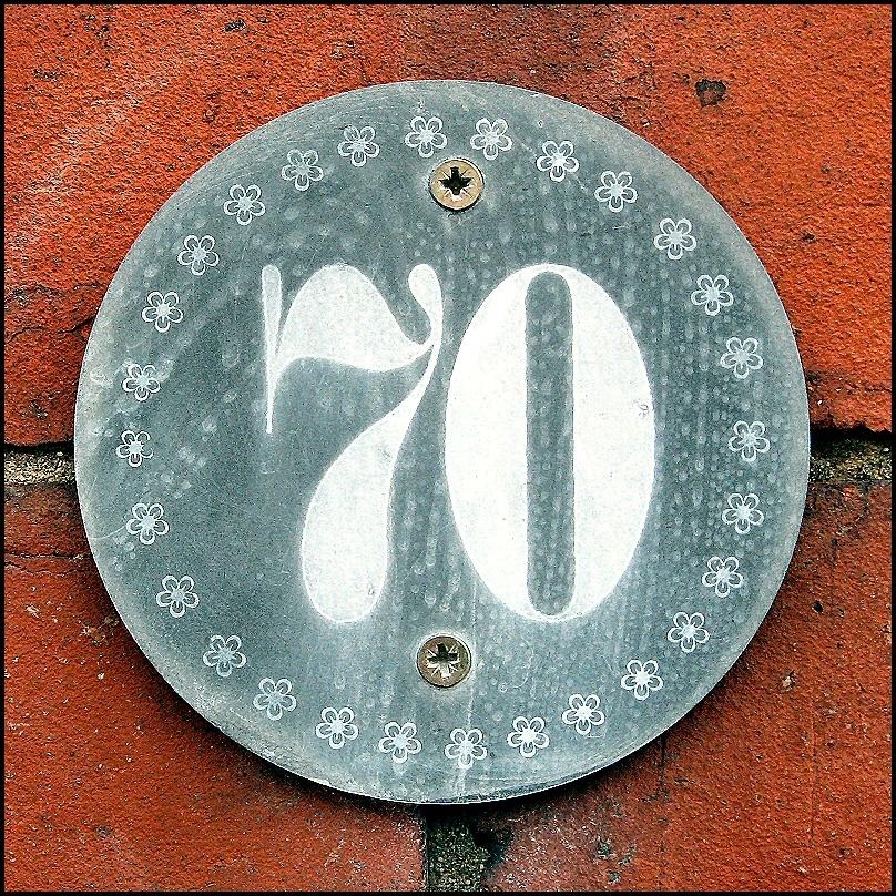
What Address Display Combines Visibility and Contemporary Design?
Homeowners often face a tradeoff between practical address identification and exterior aesthetics. Large, highly visible house numbers improve recognition from the street, but some displays appear disconnected from the overall architectural style of the property. When the goal is to strengthen address visibility while preserving a clean and cohesive exterior appearance, a modern address plaque offers a solution that integrates readable address information into a contemporary design element rather than treating identification as a separate requirement.
Effective property identification depends on consistency, contrast, and placement. A modern address plaque creates a dedicated location for address details, helping visitors, delivery drivers, and service providers recognize the property more quickly. The plaque format organizes information within a defined visual structure, which improves readability and reduces the likelihood that house numbers blend into surrounding materials.
Design compatibility contributes just as much value as visibility. Contemporary homes often rely on minimal ornamentation, precise lines, and carefully selected exterior accents. A modern address plaque supports those characteristics through streamlined forms, balanced proportions, and materials that coordinate with the broader architectural style. Instead of competing with the façade, the display becomes part of the overall composition.
The combination of function and appearance makes address displays more effective over the long term. A well-positioned plaque enhances navigation, supports property recognition, and contributes to curb appeal at the same time. By bringing together practical identification and contemporary design principles, it helps create an exterior that is both easier to find and more visually refined.
Choose Contrast That Looks Intentional
Contrast is one of the most important parts of address visibility. If the display blends into the wall, the eye has to work harder to separate the numbers from the background. Dark numbers on a dark surface, thin metal characters on patterned stone, or small lettering against textured brick can make the address difficult to read from the street. Strong contrast gives the display a cleaner outline and makes the numbers easier to identify quickly.
That does not mean the display needs to look harsh. A stylish contrast can feel calm and deliberate. Black against light siding, brushed metal against darker stone, or a clean plaque surface against textured masonry can improve readability while still supporting the home’s design. The goal is to create enough separation for practical use without making the address look like an unrelated sign attached to the home.
Use the Background as Part of the Design
The surface behind the house numbers matters as much as the numbers themselves. Smooth siding, brick, stucco, wood, stone, and concrete all interact differently with address displays. Busy or uneven backgrounds usually need a more structured display, while smooth walls can support simpler installations. A plaque can be especially useful when the exterior material is visually active because it gives the address a defined stage.
Plan Placement From the Street View
House numbers should be placed where people naturally look when approaching the property. A beautiful address display loses value if it is hidden behind a porch column, tucked into a shadow, blocked by a tree, or mounted too far from the street to read clearly. Placement should be tested from the road, not only from the front step. This helps homeowners understand how the address works in real conditions.
Exterior details often influence first impressions in the same way interior details influence how buyers and guests read a home once inside. A property feels more complete when visible features are coordinated, maintained, and easy to understand. This connection between small details and overall perception is also seen in discussions about interior details buyers notice immediately, where subtle design choices can shape how a space is judged. The same principle applies outside: the address display may be small, but it carries noticeable visual weight.
Coordinate With Lighting, Mailboxes, and Landscape Features
An address display works best when it belongs to a larger exterior system. Lighting should make the numbers readable after dark. The mailbox should not compete with or contradict the address style. Landscaping should frame the entry and street-facing features without covering important information. When these pieces are coordinated, the home feels more organized and easier to navigate.
Mailboxes and nearby plantings can either support visibility or create obstruction. Homeowners who want curb appeal without blocking address details can study mailbox garden ideas that use greenery to frame the curbside area thoughtfully. The same idea applies near the front entry: plants should soften and enhance the address area, not hide it. A clear display surrounded by controlled landscaping feels both functional and attractive.
Keep Plants and Décor Away From the Numbers
Seasonal decorations, wreaths, tall planters, flags, and growing shrubs can slowly cover address information. Even if the display is readable when installed, it may become difficult to see as plants mature or porch décor changes. Leaving open space around the address helps maintain visibility throughout the year. The address should remain one of the easiest exterior details to find.
Use Size Without Overpowering the Façade
Larger numbers are generally easier to read, but scale should still suit the property. A small cottage, a wide modern façade, and a home set far back from the road may each need a different address size. The numbers should be large enough to read from a practical distance, but not so large that they dominate the elevation. Good proportion is what keeps visibility from turning into visual heaviness.
A useful method is to view the address from across the street and from a moving-car perspective. If the display requires squinting, it is probably too small, too low in contrast, or poorly placed. If it overwhelms the entry or feels disconnected from nearby fixtures, the scale may need refinement. The right size feels clear from the curb and balanced near the door.
Brand Section: A Cleaner Way to Present Address Information
A contemporary address plaque gives homeowners a structured way to present house numbers with clarity and style. It creates a defined area for identification, which helps the address stand apart from the surrounding wall, siding, brick, or stone. This is especially useful when the exterior surface has texture, pattern, or color variation that could make loose numbers harder to read.
The value of this type of display comes from its ability to combine practical readability with modern design restraint. Clean edges, balanced spacing, durable materials, and thoughtful finishes allow the address to feel integrated rather than added as an afterthought. When selected and installed carefully, it becomes part of the home’s exterior identity while improving everyday navigation.
Maintain Visibility Over Time
Address visibility is not a one-time decision. Outdoor conditions can change how well the display performs. Dirt, fading, corrosion, loose mounting, plant growth, and lighting failures can all reduce readability. Regular maintenance helps preserve both function and appearance. Cleaning the plaque, trimming nearby greenery, checking light coverage, and tightening mounting hardware are simple habits that keep the display effective.
It is also useful to review the address at night and during different seasons. A display that looks strong in daylight may need better lighting after sunset. A clear winter view may become blocked by summer growth. By treating the address area as part of ongoing exterior care, homeowners can keep the property easy to identify while maintaining a polished curb presence.
Conclusion
Improving house-number visibility does not require sacrificing style. The most effective address displays combine readable sizing, strong contrast, thoughtful placement, and materials that suit the home’s architecture. When these factors work together, the address becomes easier to find while still supporting the overall exterior design.
A well-designed plaque can solve the practical problem of identification and the visual challenge of curb appeal at the same time. It gives visitors and delivery drivers a clear reference point, helps the home feel more organized, and adds a refined detail to the front elevation. With the right balance of visibility and design, house numbers can become one of the simplest ways to make a home more functional, polished, and complete.