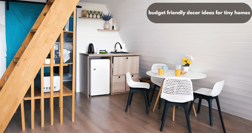
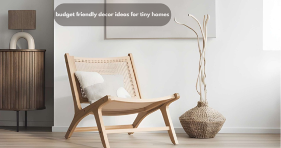
15 Budget Friendly Decor Ideas for Tiny Homes That Feel Bigger
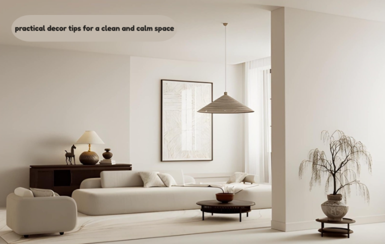
People searching for budget friendly decor ideas for tiny homes usually have two goals at the same time: make a cramped space feel visually larger without spending thousands on renovations. They also want practical ideas that work in real homes, not staged magazine apartments with hidden storage budgets and custom-built furniture.
- Small rooms feel bigger when visual weight is reduced, not when furniture is removed entirely.
- Strategic lighting, vertical layering, and furniture scale matter more than square footage.
- Many expensive-looking tiny home upgrades cost under $100 when layout and proportions are handled correctly.
Many renters in U.S. cities like New York, San Francisco, and Chicago often live in 300–500 sq ft studio apartments where every design choice directly impacts how large the space feels . Furniture sits too low or is too bulky; lighting usually comes from a single ceiling fixture, and storage ends up visible from almost every angle—that’s what I notice most when people talk about budget friendly decor ideas for tiny homes.
A 400-square-foot home can feel calmer than a cluttered 900-square-foot apartment if the visual flow is handled correctly.
Recent design trend insights from organizations such as the National Association of Home Builders and platforms like Houzz highlight a growing demand for multifunctional layouts, concealed storage, and flexible furniture in smaller living spaces.
1. Why does floating furniture instantly make a tiny home feel larger?
I’ve seen this mistake when most people shove furniture directly against walls, thinking it creates more room. In reality, that often makes the perimeter feel heavy and boxed in. Pulling a sofa even 4–6 inches away from the wall creates shadow depth behind it. The brain reads that depth as additional space.
The trick works especially well with:
- Slim-leg couches
- Open-base TV consoles
- Raised nightstands
- Floating desks
Furniture that exposes more floor visually expands the room because uninterrupted flooring creates longer sightlines. For renters, inexpensive furniture risers can achieve a similar effect without replacing existing pieces. Many of the best budget friendly decor ideas for tiny homes focus less on buying more furniture and more on improving layout flow, lighting balance, and visual spacing.
2. Could your lighting setup be shrinking the room?
A single overhead bulb flattens everything.
Tiny homes need layered lighting because shadows define depth. Without layered light, corners disappear and rooms feel compressed.
Use three levels:
- Ambient light (ceiling fixture)
- Mid-level light (table lamps or sconces)
- Low accent light (LED strips or floor uplighting)
Warm indirect light bouncing off walls makes ceilings appear taller. This technique is used constantly in boutique hotel design because it visually softens hard edges.
I’ve noticed this works especially well in smaller homes where harsh overhead lighting makes everything feel flatter than it actually is. One overlooked detail: lampshades should usually sit at eye level when seated. Oversized shades hanging too low visually cut the room in half.
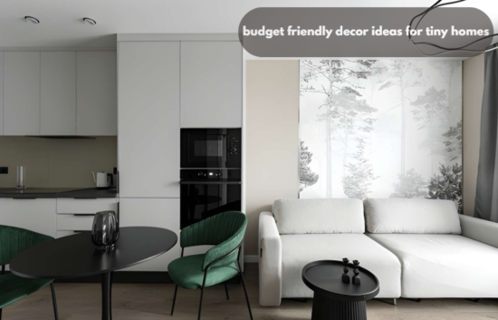
3. What paint colors actually work in tiny homes?
Pure white is not always the answer. A flat bright white can make small homes feel sterile and visually hollow. Soft warm neutrals reflect light more naturally.
Better options are warm greige, dusty sand, pale mushroom tones, soft muted olive, and warm off-white. The bigger trick is consistency.
Using drastically different wall colors between connected rooms creates visual stopping points. Tiny homes benefit from continuous tonal flow because the eye moves more smoothly across spaces.
Low-contrast trim also helps. Sharp white trim around darker walls creates hard framing lines that visually shorten walls.
4. Why do oversized rugs make small rooms look expensive?
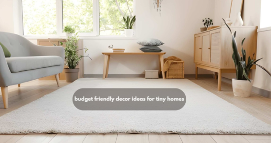
Tiny rugs actually do the opposite of what most people expect—they end up making the room feel smaller. I’ve noticed that an 8×10 rug in a compact living area usually feels more grounded and calmer than a smaller 5×7 that just floats awkwardly in the middle.
Interior stylists commonly use this visual expansion principle:
- Front legs of all seating should sit on the rug
- Leave roughly 8–12 inches of visible floor around the edges in smaller rooms
This creates a unified furniture zone instead of disconnected pieces competing for attention.
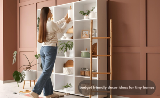
5. How can vertical storage stop visual clutter?
Tiny homes fail visually when storage spreads horizontally.
Tall storage draws the eye upward, which stretches the perceived ceiling height.
A friend in the USA recently remodeled a small apartment and used vertical slat shelving, and it completely changed how open the place felt.
Full-height bookcases make better use of dead wall space, wall-mounted kitchen rails keep counters clear without adding bulk, ceiling-height curtains instantly lift the room visually, and stacked cube storage helps maximize storage without spreading clutter across the floor.
A cluttered countertop creates more visual pressure than a full bookshelf because loose horizontal objects interrupt eye movement constantly.
Many decoratoradvice .com partners frequently highlight vertical organization because it increases usable storage without eating floor area.
6. Are glass and acrylic pieces worth it in small spaces?
Usually yes — if used selectively.
Transparent materials visually disappear. Acrylic coffee tables, ghost chairs, and glass consoles maintain functionality without adding visual heaviness.
This works best when mixed with warmer textures like the following:
- Linen
- Natural wood
- Matte ceramics
- Textured cotton
Too many transparent pieces can make a home feel temporary or cold. One acrylic element per room is usually enough.
7. Why do curtain mistakes make ceilings look lower?

Curtain placement changes architectural perception more than people realize.
Mount curtain rods.
- 6–10 inches above the window frame
- Wider than the actual window
This creates the illusion of taller walls and wider windows.
Floor-length curtains also matter. Curtains stopping above the floor visually cut vertical height.
Designers working in compact urban apartments often fake taller ceilings purely through textile placement.
8. What kind of furniture scale works best in tiny homes?
In my opinion, small furniture is not always the solution.
Too many tiny pieces create visual fragmentation.
A compact home often looks cleaner with: One medium-sized sofa, one large rug, one defined coffee table
Instead of multiple tiny chairs, several nesting tables, and excess decorative stools.
The eye prefers fewer dominant forms over dozens of competing mini-elements.
Furniture depth matters more than width. A sofa under 36 inches deep typically preserves better circulation in narrow spaces.
9. Can mirrors still work without looking outdated?
Yes—when they reflect light, not random clutter.
The old “just add mirrors” advice fails because placement matters more than mirror size.
Best placements:
- Across from windows
- Near dining areas
- Adjacent to warm lighting
- Behind narrow hallways
Avoid reflecting storage zones or television walls. Large frameless mirrors tend to feel more architectural and less decorative in modern tiny homes.
10. Why should tiny homes avoid excessive open shelving?
Open shelving photographs beautifully but performs poorly in real daily life.
Visible objects create cognitive noise.
From what I’ve seen in recent home organization studies, homeowners often move toward hidden storage once they experience how quickly visual clutter builds up.
A better ratio:
- 70% closed storage
- 30% styled open display
This balance keeps personality without overwhelming the room.
11. How do designers create “movement” inside small rooms?
Good small-space design guides the eye naturally.
That means repeating consistent design elements like similar wood tones, unified metal finishes, rounded shapes, and matching textiles to create a more cohesive and visually calm space.
When every item looks unrelated, the room feels chaotic.
Repetition creates rhythm. Rhythm creates calmness.
A simple professional technique is repeating the same material across different heights in the room. For example: an oak shelf, an oak coffee table, and an oak picture frame.
The brain reads that repetition as intentional structure.
12. Should tiny homes use dark colors at all?
Absolutely.
Dark accents create contrast depth, which can actually increase spatial perception.
The key is placement.
Use darker tones on:
- Lower cabinetry
- Accent chairs
- Small wall sections
- Matte hardware
Avoid making every wall dark unless the home has exceptional natural light.
Balanced contrast prevents the washed-out effect common in overly white tiny interiors.
13. Why do multipurpose pieces sometimes make rooms worse?
Because many transformable furniture items are oversized and mechanically bulky.
Some sleeper sofas consume more visual space than standard couches.
Instead of chasing “10-in-1” furniture, prioritize pieces that naturally perform multiple roles:
- Storage ottomans
- Benches with drawers
- Extendable dining tables
- Slim console desks
- Wall hooks doubling as decor
The best multifunctional furniture rarely looks multifunctional.
14. Could reducing decor actually make the room feel richer?
Yes. Sparse styling often looks more expensive.
Tiny homes benefit from intentional negative space.
Instead of decorating every surface:
- Leave some shelves partially empty
- Keep countertops mostly clear
- Use fewer but larger decorative objects
- Limit competing colors
Luxury interiors rarely rely on quantity. They rely on breathing room.
This principle appears constantly in modern minimalist apartment styling shared across decoratoradvice com communities and interior trend discussions.
15. What is the cheapest upgrade with the biggest visual payoff?
Changing hardware and fixtures.
Replacing small hardware elements like cabinet pulls, switch plates, faucet finishes, lamp shades, and outlet covers can instantly refresh a space without requiring a full renovation.
can dramatically modernize a tiny home for surprisingly little money.
Matte black, brushed nickel, and muted brass continue trending in 2025–2026 interiors because they create cleaner visual consistency across compact spaces.
Small details matter more in tiny homes because everything remains visible simultaneously.
Tiny Home Decor Value Matrix
| Decor Upgrade | Estimated Budget | Visual Space Impact | Difficulty Level | Best Room |
| Floating furniture layout | $0–$50 | High | Easy | Living room |
| Ceiling-height curtains | $40–$120 | High | Easy | Bedroom/Living room |
| Layered lighting | $60–$200 | Very High | Medium | Entire home |
| Oversized rug | $80–$250 | High | Easy | Living room |
| Vertical shelving | $50–$180 | Medium | Medium | Kitchen/Home office |
| Acrylic or glass accents | $40–$150 | Medium | Easy | Living room |
| Concealed storage bins | $30–$100 | High | Easy | Bedroom |
| Hardware replacement | $25–$120 | Medium | Easy | Kitchen/Bathroom |
| Large mirror placement | $70–$200 | High | Easy | Hallway/Living room |
| Neutral tonal repainting | $100–$350 | Very High | Medium | Entire home |
Final Thoughts
Small homes respond dramatically to proportion, lighting, and visual balance. Expensive renovations are often unnecessary when the real issue is scale confusion, clutter visibility, or poor furniture spacing.
The strongest budget friendly decor ideas for tiny homes usually involve subtraction before addition. Better spacing. Cleaner sightlines. Smarter lighting. Less visual interruption.
That shift alone can completely change how a space feels to live in every day.