The Modern Walnut Kitchen: Why Two-Tone Cabinets Are Stealing the Spotlight
Key Takeaways:
Pure white kitchens can feel sterile, but wall-to-wall dark walnut can easily overwhelm a standard room’s natural daylight.
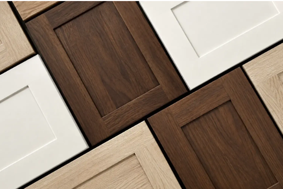
Two-tone cabinetry solves the contrast puzzle by mixing organic timber warmth with crisp, reflective painted surfaces.
Micro-frame doors (like Slim Shaker) give natural grain room to breathe, avoiding the clunky lines of traditional farmhouse cabinets.
For years, kitchen design played it safe. We lived through endless waves of all-white shaker cabinets, subway tile backsplashes, and polished chrome accents. While clean, that look often lacked soul.
Today, natural wood is having a massive resurgence, and American Black Walnut is leading the charge. With its rich mocha depth, gentle amber highlights, and organic warmth, it brings an unmistakable architectural calm into the home. But there is a catch: wrap an entire average-sized kitchen in dark timber, and the room can quickly feel like a dimly lit cave.
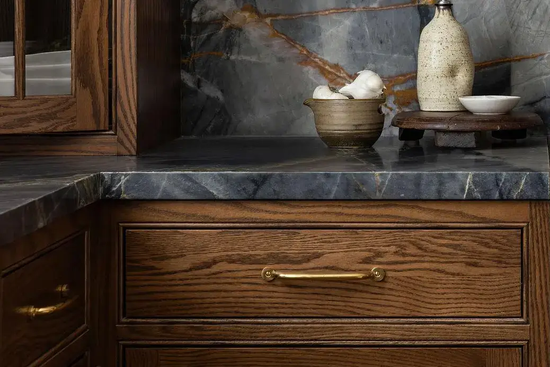
The design solution taking over modern renovations is surprisingly simple: the two-tone balance.
1.Choose Your Focal Point: Island Anchor vs. Feature Wall
A successful two-tone kitchen is not about scattering colors randomly; it is about controlling visual weight and where your eye lands first.
The Grounded Centerpiece: In standard homes with typical eight- or nine-foot ceilings, keep perimeter walls soft and light. Using warm off-white or soft greige on wall cabinets reflects ceiling light inward. Then, introduce rich walnut exclusively across the central island. It instantly turns the prep area into a freestanding, furniture-grade centerpiece without dimming your work counters.
The High-Ceiling Statement: If your kitchen features soaring ceilings and generous windows, consider flipping the palette. A floor-to-ceiling walnut pantry wall conceals large appliances with seamless drama, while a bright waterfall island in the foreground bounces sunlight across the room to keep the overall mood open and airy.
2. Let the Timber Breathe: Slim Profiles over Clunky Frames
One of the biggest mistakes in timber kitchens is using heavy, two-inch-wide traditional shaker framing. Wide frames trap the eye and interrupt the organic flow of the woodgrain, making the doors feel crowded.
Contemporary designers lean heavily toward modern Slim Shaker framing—featuring ultra-narrow rails around half an inch wide. This slim border creates a crisp, tailored shadowline while leaving over 85% of the panel surface open to show off continuous woodgrain patterns.
When planning how these contrasting finishes meet, exploring practical case studies on walnut kitchen cabinets in a two-tone layout offers great visual inspiration for coordinating continuous grain flow, subtle reveals, and appliance panel margins.
3. Pairing Palettes that Feel Effortless
Walnut has rich, warm undertones. To make it sing, pair it with hues that complement rather than clash:
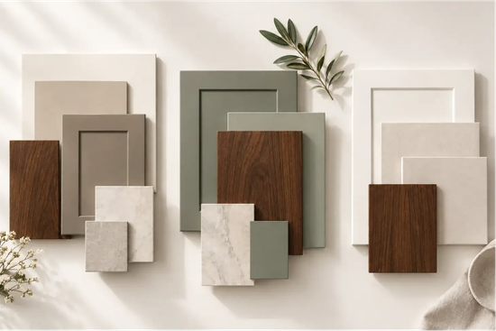
Warm Greige & Plaster White: Pure stark white can feel jarring against natural timber. Soft plaster tones, oatmeal, and warm stone greiges blend smoothly with the wood’s amber highlights.
Muted Sage Green: Nature never clashes with wood. A dusty sage or muted olive green on perimeter uppers introduces a calm, biophilic aesthetic that feels grounding and timeless.
Bringing It All Together
Designing a kitchen with real character is about contrast and harmony. By introducing natural walnut through a tailored two-tone layout, you get the best of both worlds: the timeless warmth of organic hardwood and the breezy, light-filled comfort of modern living.